Executive Creative Director
//Expertise //Brand Design //Custom Typography //Digital Design
finance // max
//Visual Identity
2020—2022
Responsibilities
Directed the creative strategy to develop a bold, differentiated brand that resonated with both retail and business consumers.
Led the team in crafting a new name and identity that ensured seamless recognition and memorability during the transition from Leumi Card to the new brand.
Oversaw the creation of a cohesive visual and verbal identity, positioning the brand for long-term success while maintaining continuity with its trusted legacy.
Guided cross-functional collaboration to ensure the new branding met strategic objectives and aligned with consumer expectations.
Challenge
Leumi Card faced a critical juncture as it transitioned from being a subsidiary of a major bank to an independent entity. The challenge was to develop a bold and distinctive brand that would resonate strongly with both retail and business audiences, ensuring recognition and memorability in a competitive market. Additionally, the new name and identity needed to strike a balance—signaling independence while maintaining the trust and familiarity built under the Leumi Card name, all without disrupting customer loyalty or market positioning during the transition.
approach
Defining the Brand Personality: We began with collaborative workshops to uncover the essence of the new brand, ensuring alignment with the company’s vision and customer expectations.
Strategic Naming Process: Through extensive research and ideation, we identified the name max—a reflection of the brand’s promise to help customers maximize their financial potential.
Crafting the Visual Identity: Focused on bold differentiation, we designed:
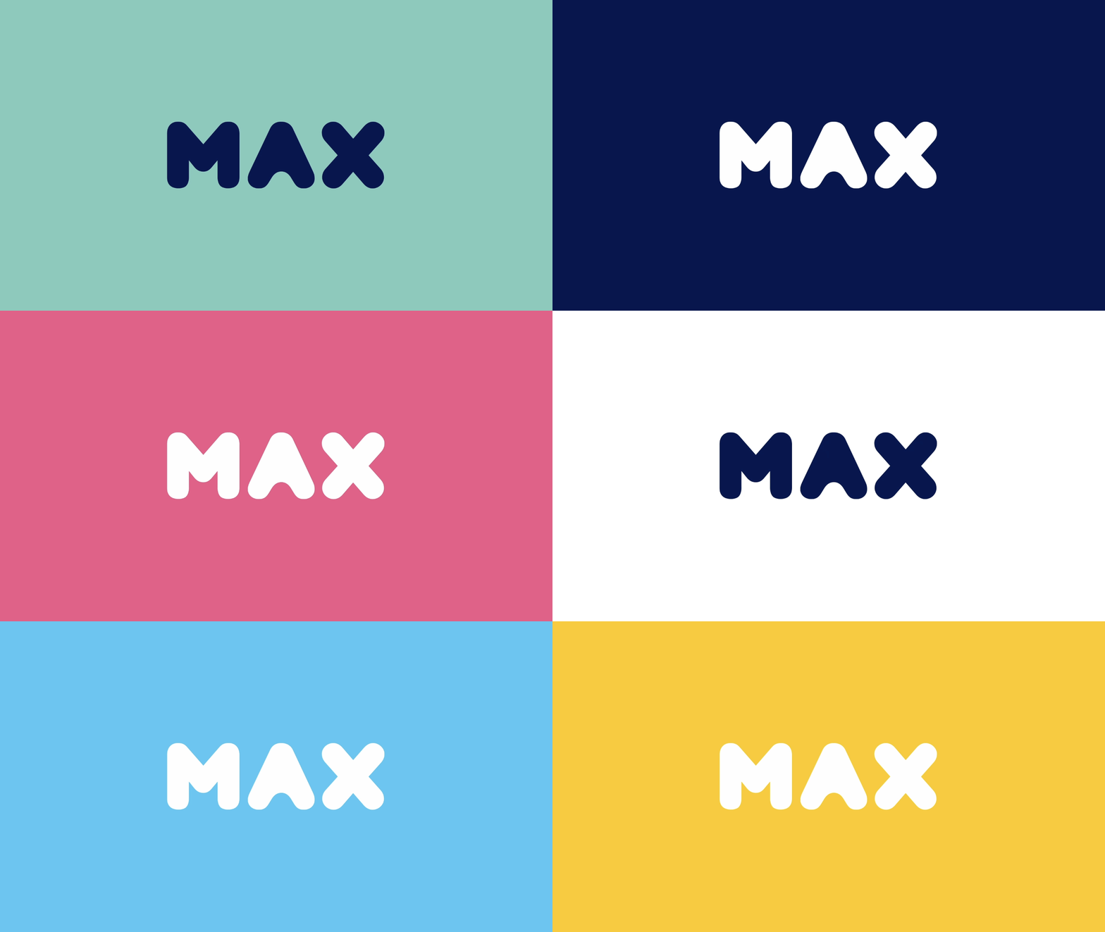
A strong and simple logo that stands out in the financial sector.
A custom font to enhance the brand's unique personality.
Redesigned credit cards that balance modern aesthetics with functionality.
Seamless Digital Transformation: Delivered a cohesive design for the website and mobile app, ensuring the new identity was consistently represented across digital platforms.
Focus on Differentiation: Throughout the process, we ensured that max established its independence with a bold and memorable identity while staying approachable and relevant to its diverse audience.
Solution
To establish a bold and memorable identity for Leumi Card’s transition to max, we implemented a comprehensive rebranding strategy:
Collaborative Brand Development: Conducted a series of workshops with stakeholders to define the new brand personality, ensuring alignment with the company’s goals and customer expectations.
Strategic Naming: Identified and finalized the name max, encapsulating the brand’s promise to help customers maximize their financial potential and achieve more with their money.
Distinct Visual Identity: Designed a cohesive visual system to differentiate max in the competitive financial market, including:
A sturdy, bold logo that is simple, modern, and memorable.
A custom font to reinforce the brand’s unique personality.
Redesigned credit cards that combine aesthetic appeal with functionality.
Digital Integration: Delivered a fully designed website and mobile app, ensuring the new brand identity is seamlessly reflected across digital platforms for a consistent customer experience.
Customer-Centric Focus: Crafted an approachable and impactful brand that resonates with both retail and business consumers while ensuring a smooth and confident transition from Leumi Card to max.
outcome
The new brand, max, embodies its core promise: helping customers "make more out of their money." Balancing trustworthiness with a celebration of life and enjoyment, max redefined its position as both a reliable financial service provider and an energizing, forward-thinking brand.
Visual Identity: Retained a primary palette of blues to communicate stability and trust, complemented by a vibrant secondary palette to introduce excitement and modernity, setting a distinctive tone within the financial landscape.
Integrated Solutions: The redesigned logo and identity inspired a cohesive brand ecosystem, including a proprietary font, striking credit card designs, dynamic marketing materials, and a fully integrated website and mobile app.
Market Differentiation: The bold and approachable identity established max as a modern, memorable, and customer-centric leader in the financial sector.
Brand identity development & design
logo development
Digital design
international design & custom max typeface
Designing the MAX brand required a deep focus on international considerations to ensure the brand resonated across diverse cultural and linguistic contexts. The creation of the proprietary MAX font, developed in collaboration with Fontef, seamlessly integrated English, Hebrew, and numerical data, reflecting the company's bilingual and financial needs. The visual identity balanced universal appeal with local relevance by pairing a globally recognizable blue palette—symbolizing trust and stability—with vibrant secondary colors to convey energy and modernity. Every design element, from the logo to the mobile app, was crafted with scalability and adaptability in mind, ensuring that max could confidently expand its reach while maintaining consistency and cultural sensitivity. This approach reinforced the brand's ability to engage diverse audiences and position itself as a leader in the evolving global financial landscape.


