Executive Creative Director
//Expertise //Brand Design //Custom Typography //Digital Design
industry // client
//Creative, Brand, Design, Product, Video //DesignIt
2020—2022

Responsibilities
I led an international team of designers, strategists, and creatives in executing the global rebrand for Designit. I was responsible for setting the overall creative vision and aligning cross-functional teams across multiple regions to ensure cohesive execution of our new identity. This involved overseeing the development of the Alphabeta typeface in partnership with Letters from Sweden, guiding the creation of Bauhaus-inspired illustrations, redesigning our digital presence, and establishing a fresh photography direction. By managing every aspect of the creative process—from initial concept to final delivery—I ensured our rebrand not only captured our storied legacy but also positioned Designit as a forward-thinking global leader.

Challenge
After 30 years of innovation, Designit faced a rapidly evolving market where the complexity of modern organizations and consumer lifestyles demanded a fresh, agile visual identity. The agency’s existing brand was deeply rooted in its storied past but no longer captured the breadth of its creative service offerings—spanning strategy, design, marketing, and technology—nor did it reflect the dynamic, international scope of its work. The challenge was to reposition Designit from a legacy design house into a forward-thinking, global creative powerhouse while retaining the essence of its heritage.
approach
In my role as Executive Creative Director, I assembled and led an international team to embark on a comprehensive rebrand initiative. We began with an in-depth exploration of Designit’s legacy and current market challenges, conducting workshops, stakeholder interviews, and competitive analysis to uncover the essence of the brand and identify areas ripe for evolution. Our collaborative process emphasized the need to balance tradition with modernity, driving us to explore every facet of the brand—from typography and illustration to digital presentation and photography. Working closely with external partners, including a collaboration with Letters from Sweden, we set out to create a cohesive visual language that would resonate globally while remaining true to the agency’s human-centric design philosophy.

Manifesto

Solution
We introduced Alphabeta, a new geometric sans serif typeface crafted with Letters from Sweden that merges technological innovation with human intuition, paying tribute to Denmark’s typographic heritage. Complementing this, we developed a Bauhaus-inspired illustration style featuring primary colors and geometric forms, completely redesigned designit.com with a playful grid layout to spotlight client work, and launched a fresh, authentic photography direction capturing the vibrant, unpolished beauty of design in progress.
New Typeface:
Introduced Alphabeta, a geometric sans serif typeface designed with Letters from Sweden.
Features open g’s, a high x-height, and wide letterforms that blend technology with human intuition, honoring Denmark’s typographic legacy with a modern twist.
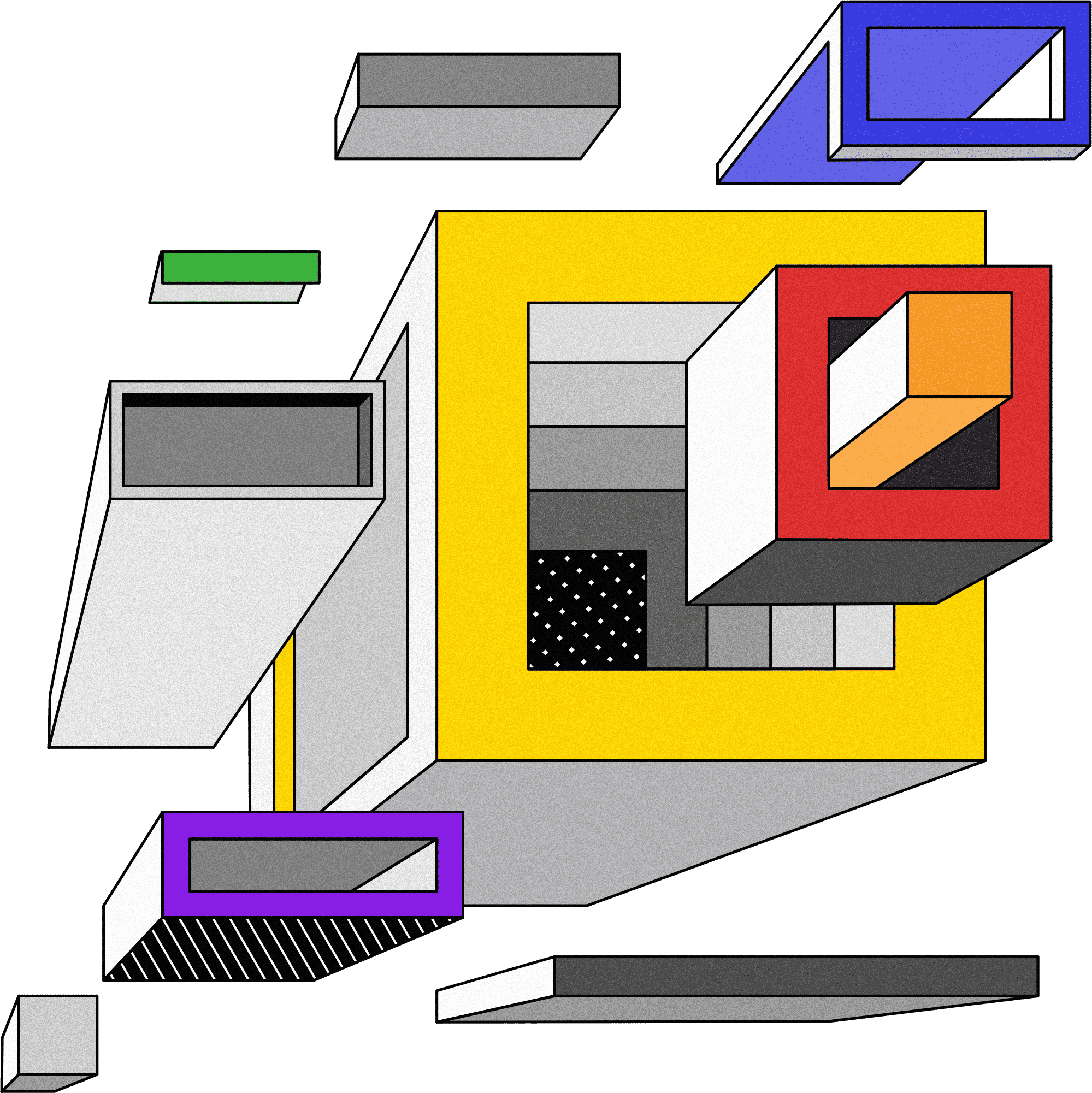
Illustration Style:
Developed a style inspired by De Stijl, Bauhaus, and early graphic posters.
Uses primary colors and basic geometric forms with delightful, unexpected details.
Website Redesign:
Completely revamped designit.com using a playful grid layout.
Restructured content and messaging to emphasize client work over self-promotion.
Photography Direction:
Introduced a fresh, unpolished, authentic, and energetic photography style.
Captures the beauty of design-in-progress and highlights the vibrant cultures across Designit’s global offices.

results
The comprehensive rebrand successfully repositioned Designit as a forward-thinking global design leader. The launch of the new visual identity was met with enthusiastic internal and external acclaim, with stakeholders noting that the refreshed design language clearly communicated the agency’s evolved strategic ambitions and creative capabilities. The refined typography, innovative illustration style, and authentic photography not only unified the brand across diverse channels but also significantly enhanced client engagement by providing a more compelling narrative of design in action. The redesigned website now serves as a dynamic showcase for both the agency’s work and its clients, creating a cohesive, high-impact digital presence that continues to drive deeper connections in a competitive, rapidly evolving market.

designit "alphabeta"

Custom Typeface
Alphabeta is a groundbreaking geometric sans serif typeface developed in collaboration with Letters from Sweden as part of the Designit global rebrand. It seamlessly fuses technology with human intuition, capturing the essence of Denmark’s rich typographic heritage while offering a fresh, modern edge that perfectly reflects Designit's forward-thinking vision.
Crafted as the visual cornerstone of Designit's new brand identity.
Inspiration: Draws inspiration from Denmark’s storied typographic legacy.
Key Features: Features open g’s, a high x-height, and wide letterforms, creating an inviting yet robust look.
Enhanced Functionality: Enhances legibility and functionality while evoking technological precision fused with organic human qualities.
Geometric Structure: Rooted in fundamental shapes with subtle, unexpected details that add personality and depth.
Balanced Design: Balances classic influences with a contemporary twist, embodying the spirit of innovation and creativity, making it versatile and enduring for a global audience.