Creative Direction
// Creative, Design, Pitch, Launch
Proctor & Gamble
// Cheer
context
Proctor & Gamble's Cheer, laundry detergent, brand was looking to revitalize, reinvent and relaunch itself for a new market aimed at younger and more cost conscious consumers. But not only is the product cheaper, Cheer actually has the best color science for treating clothes within the CPG market. The science was so good that Tide, also a leading P&G detergent brand, used many of Cheer's formulas to make it's on product better.
Challenge
In light of this, P&G wanted to differentiate Cheer for a different marketplace. Cheer wanted to show itself as the brand that loves colors.
Build a brand that communicates that Cheer equals color in the minds of the consumer.
Solution
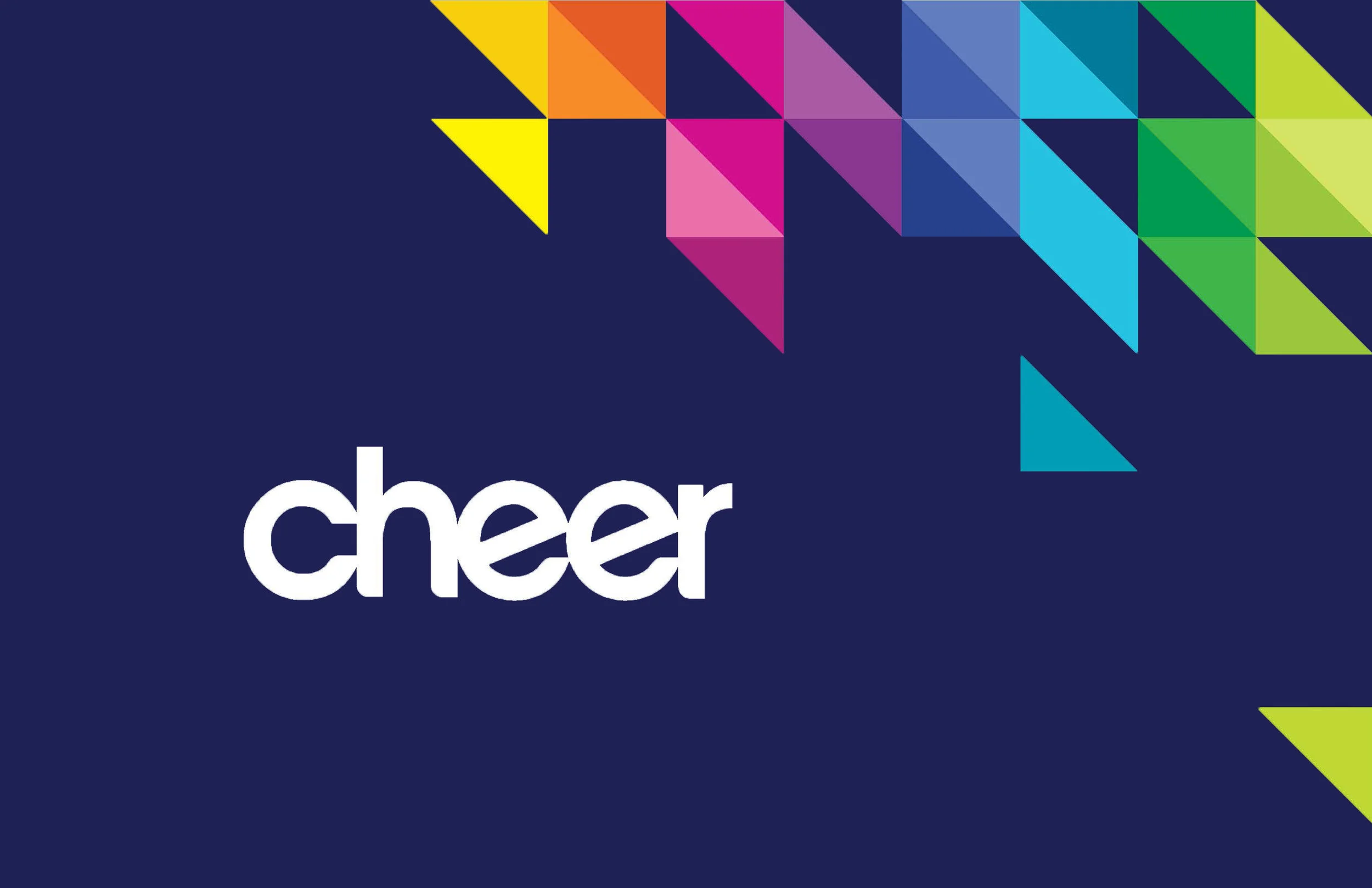
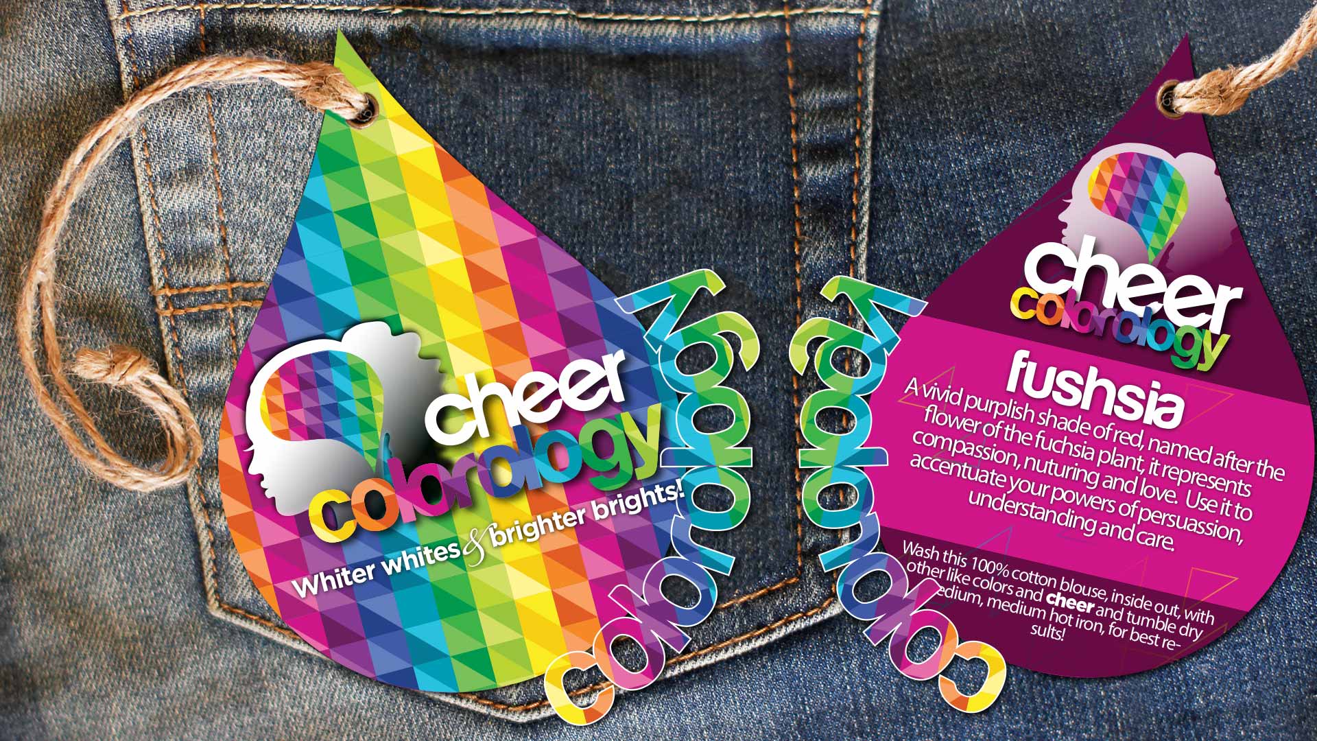
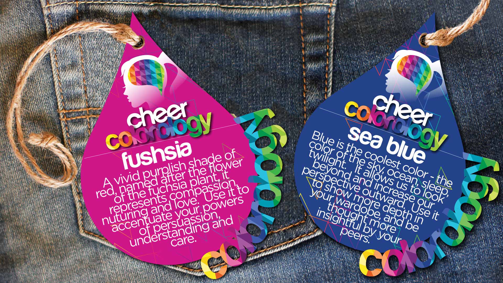
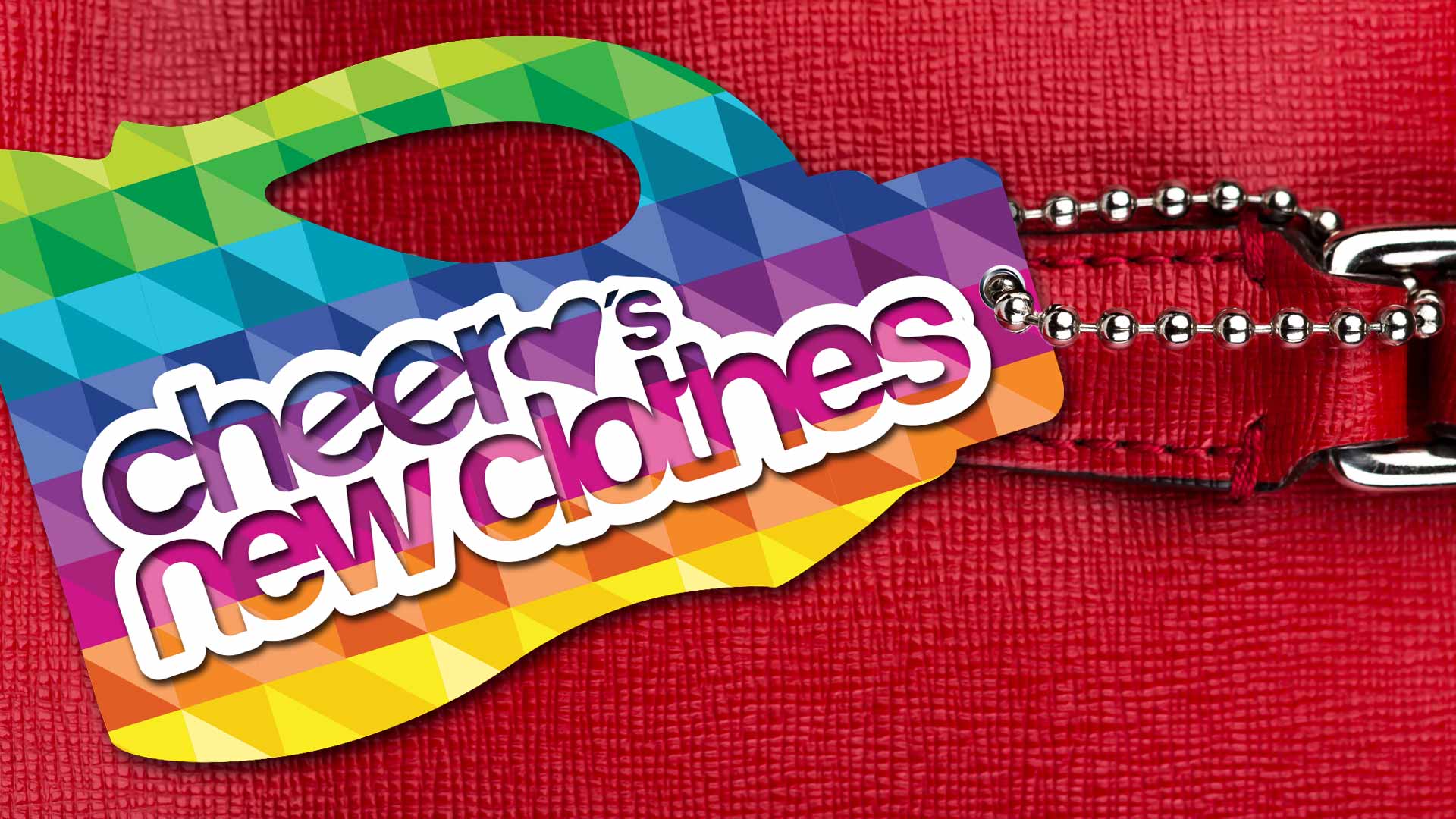
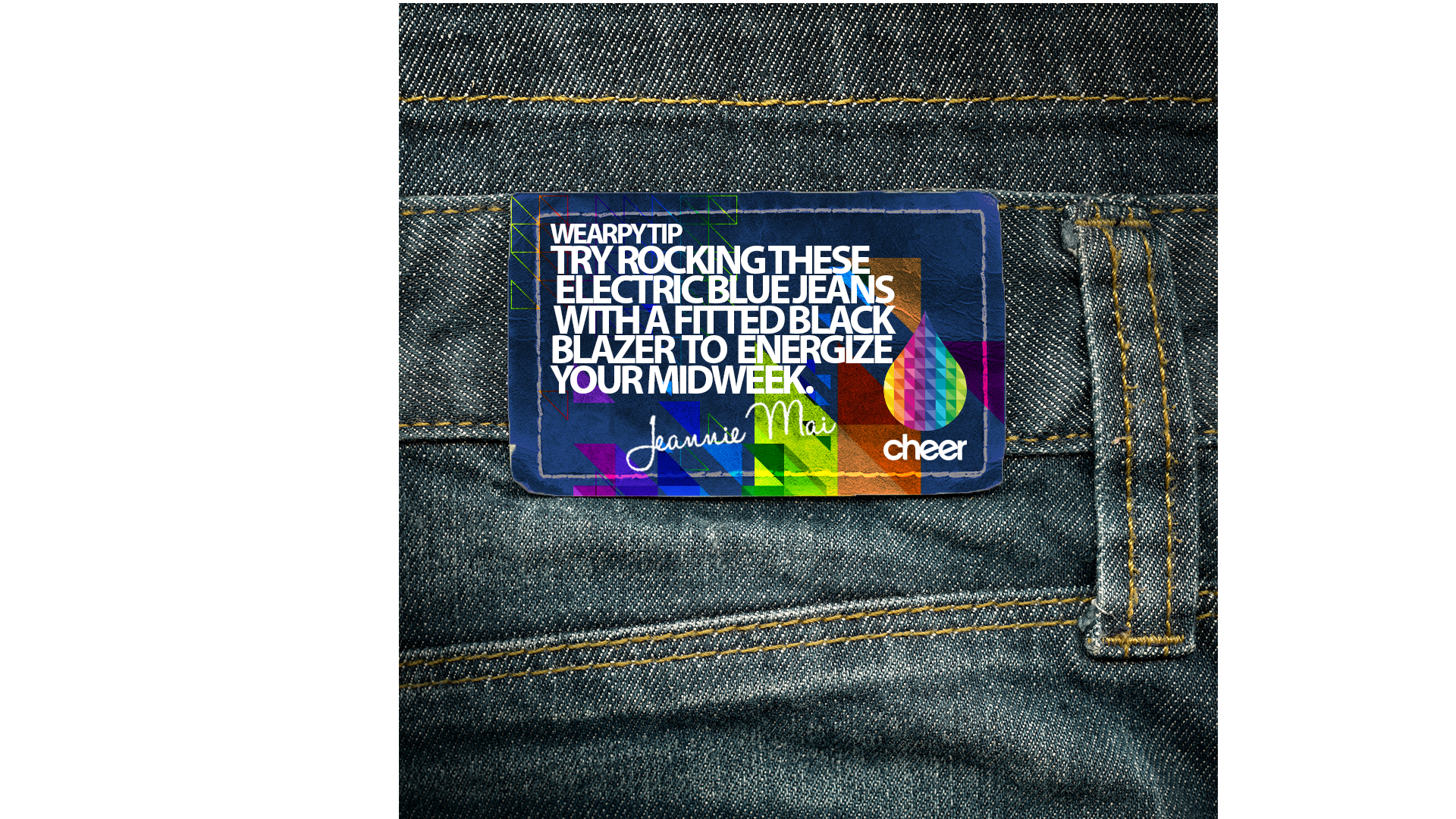
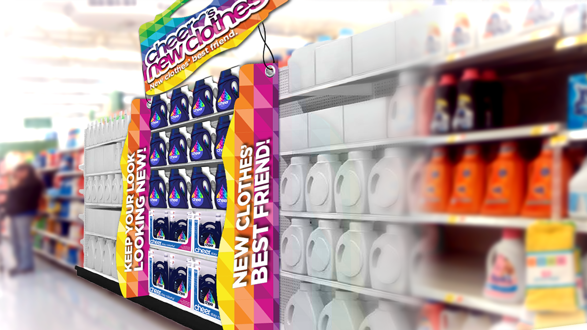
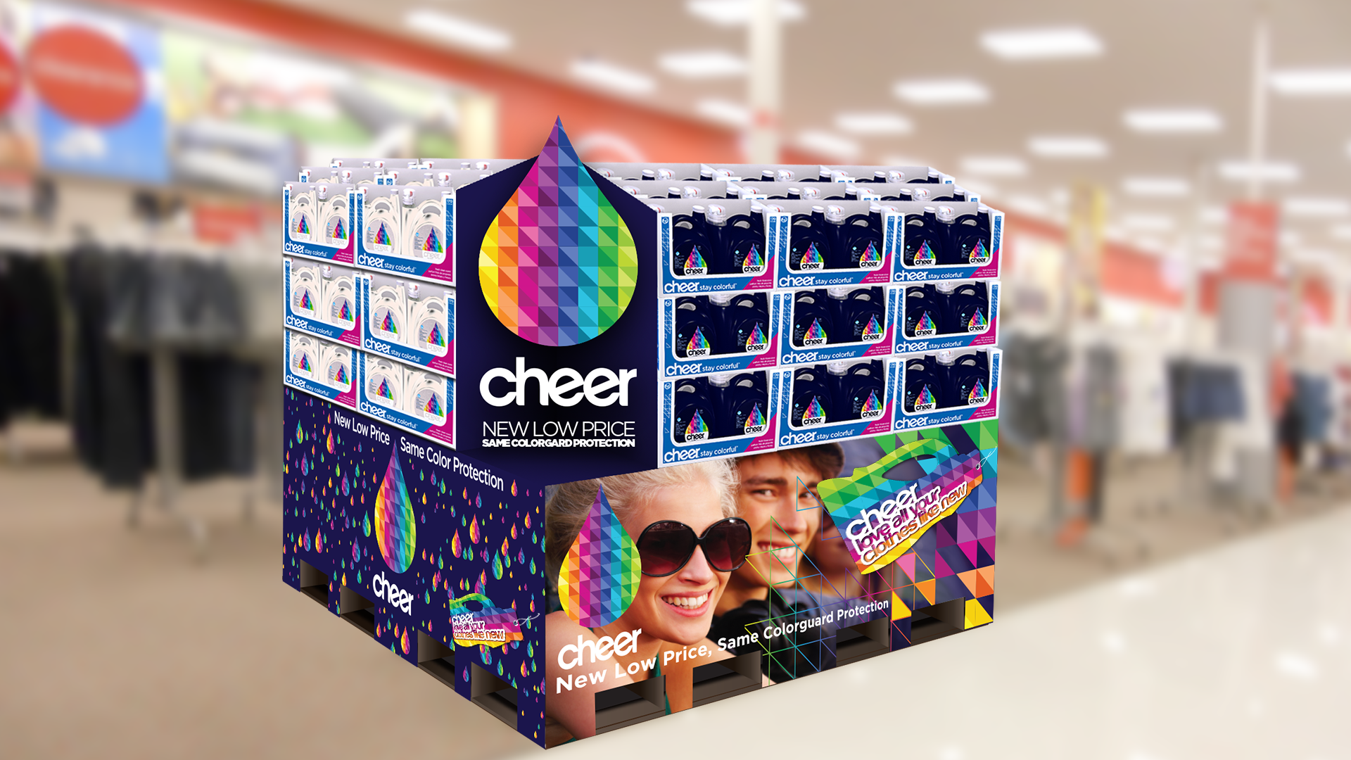
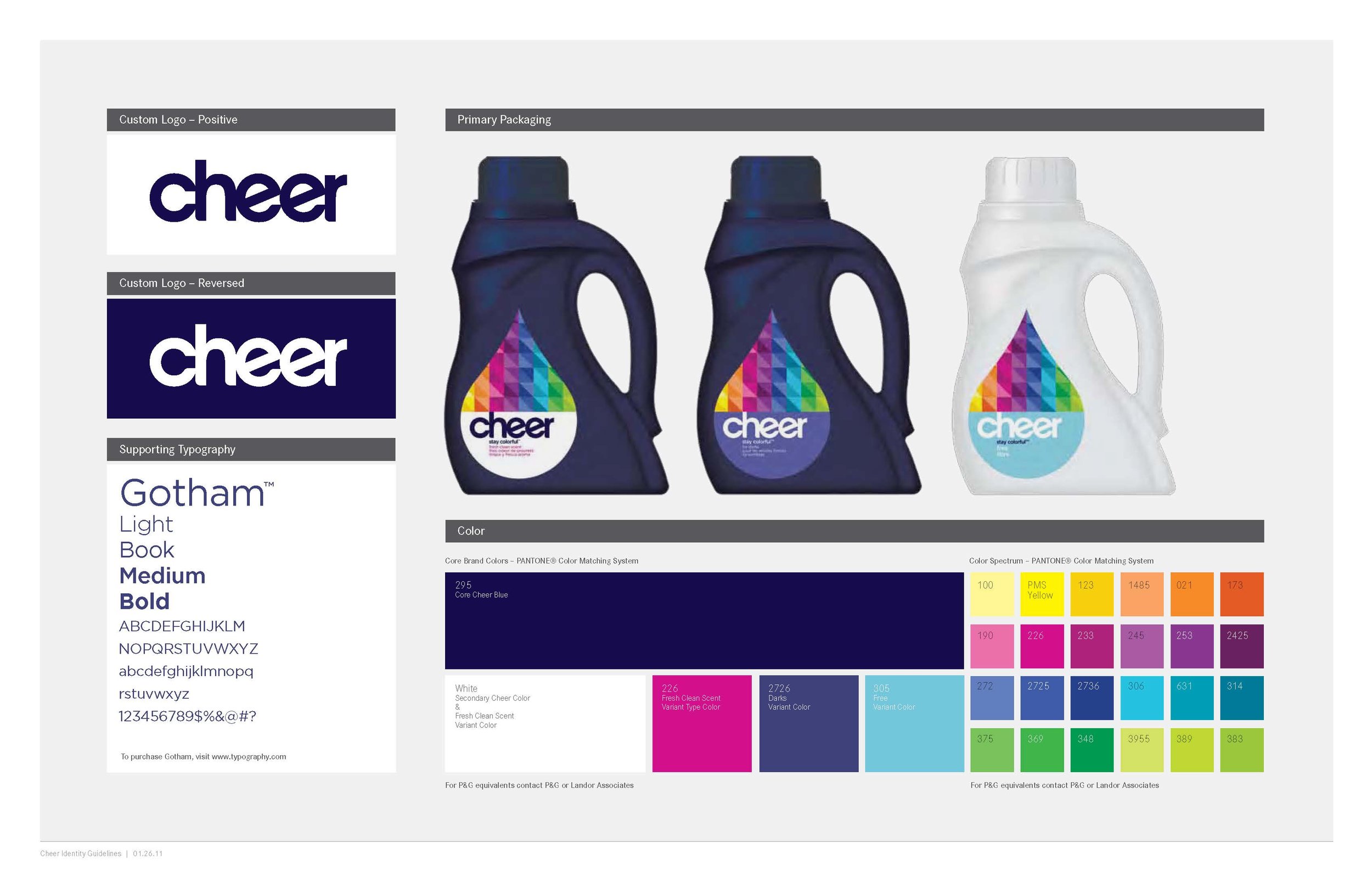
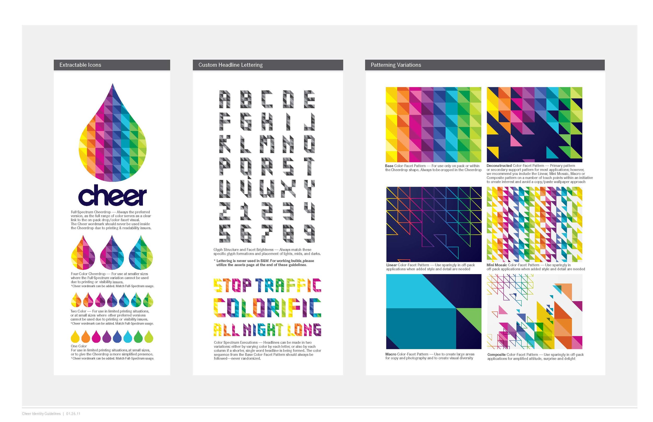
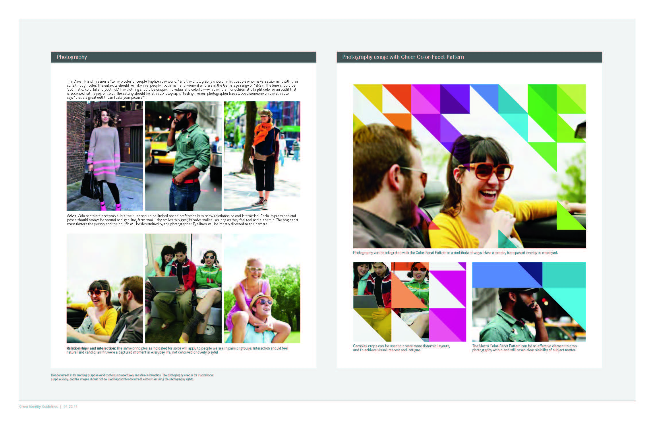
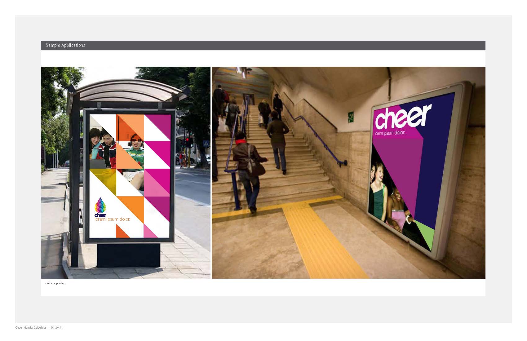
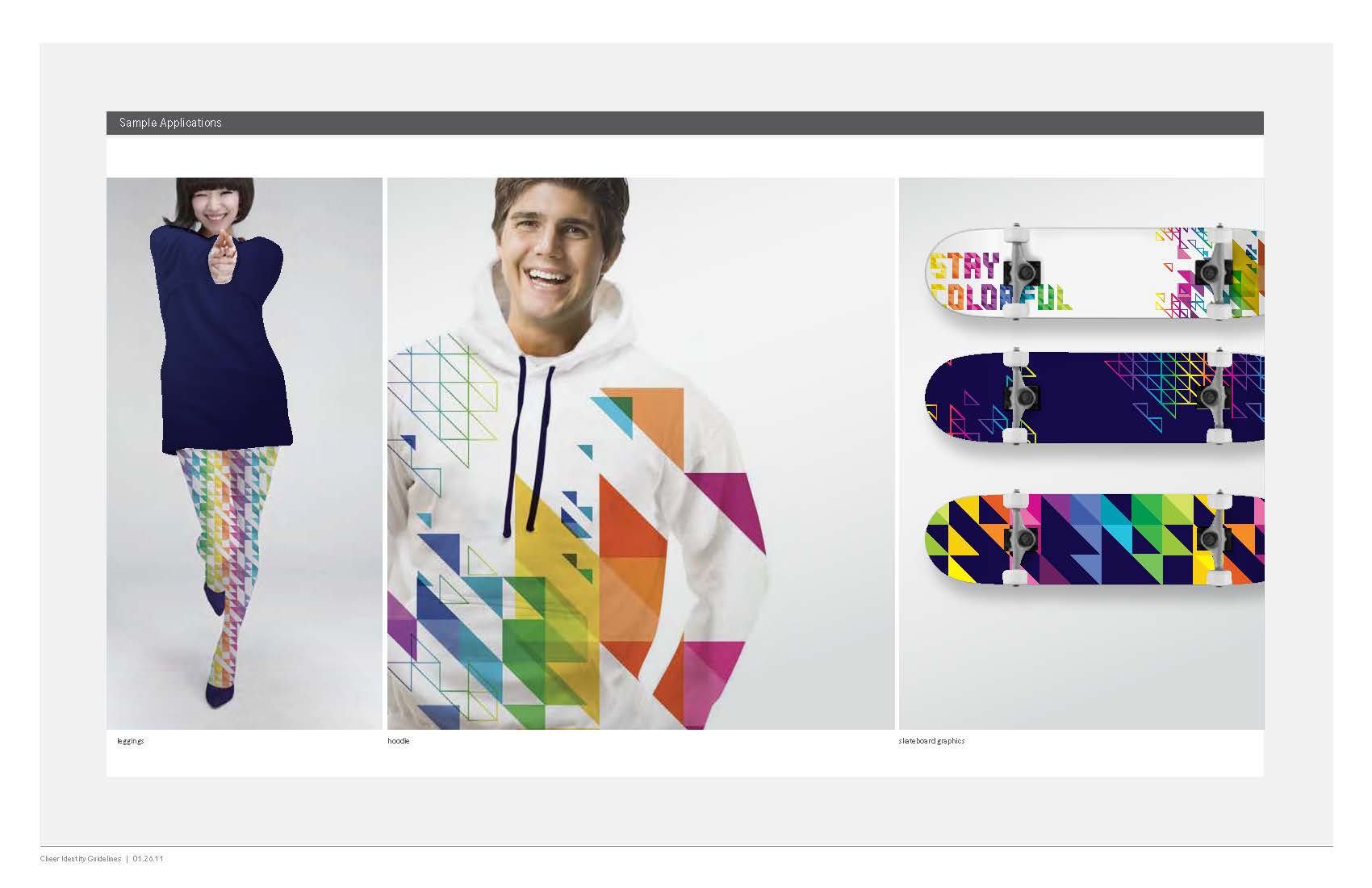
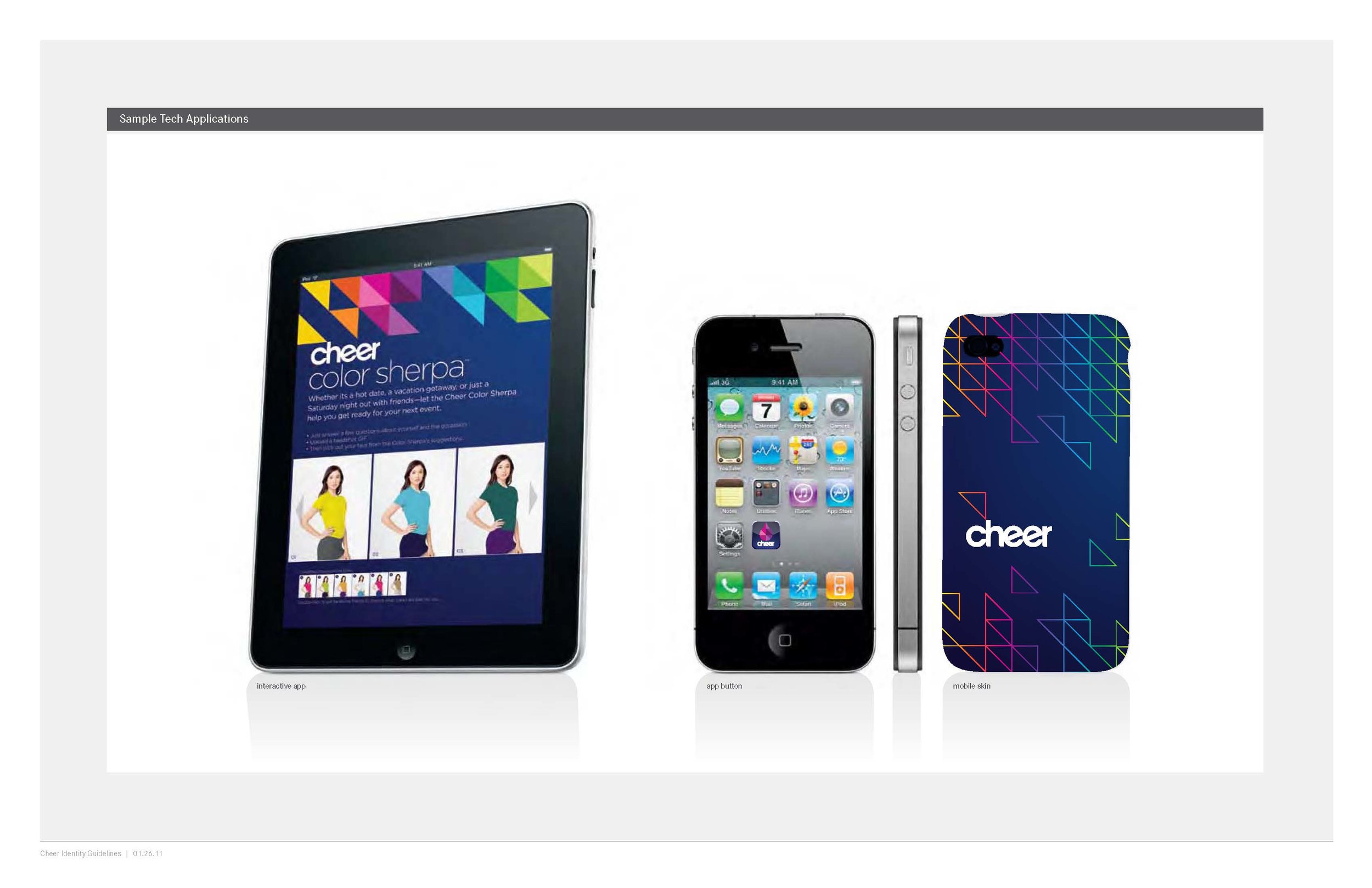
In partnership with Landor, we developed not just a re-brand for the company but a complete design system under which the fresh new Cheer brand would live and thrive. It is meant to be an energetic and surprising brand, that engages versatile and changing colors and patterns, and is impossible to ignore when viewed on the self.
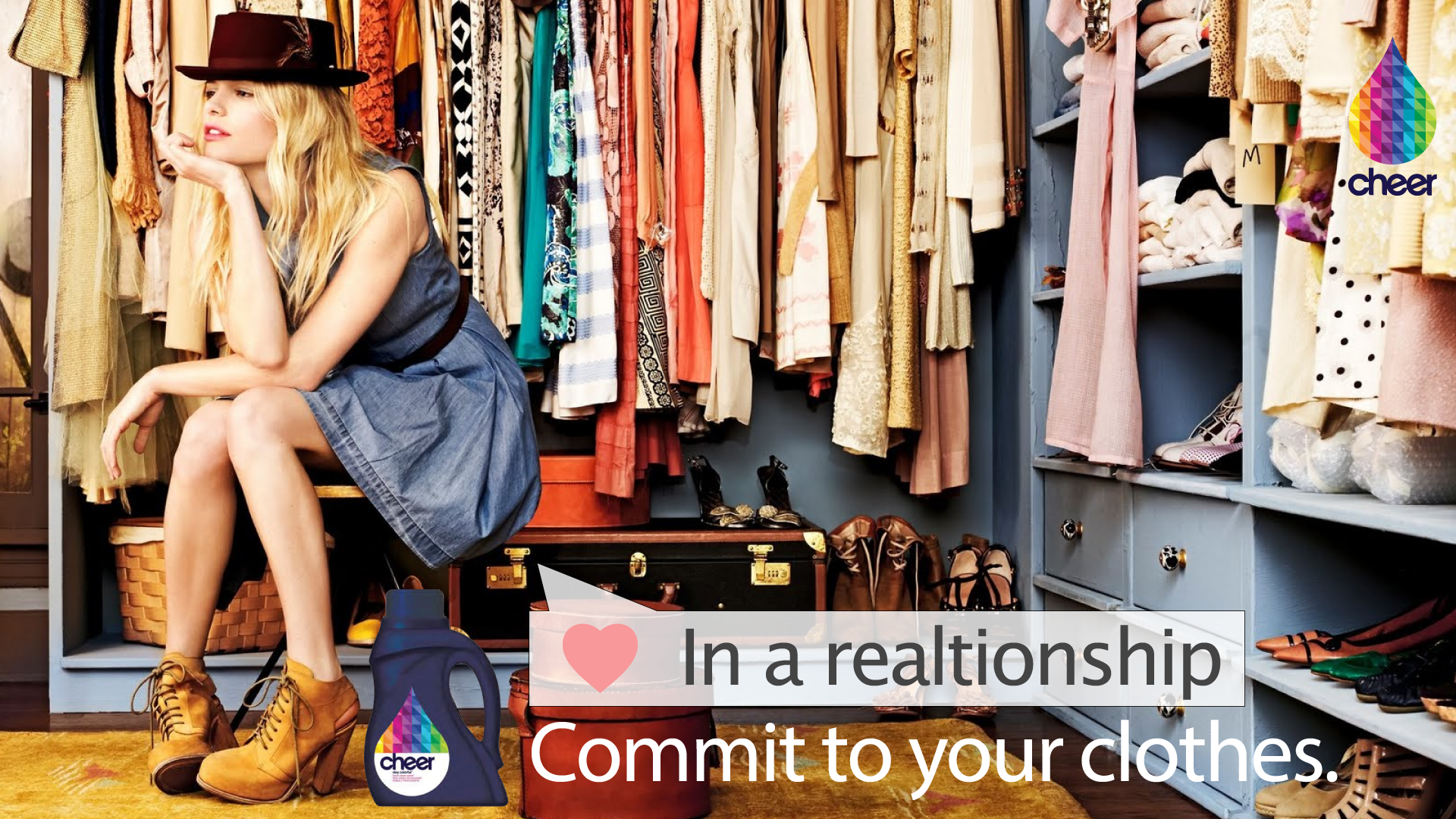
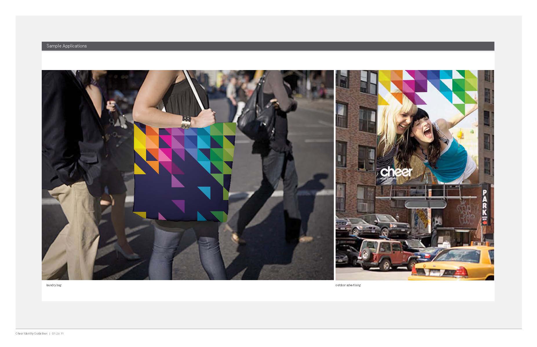
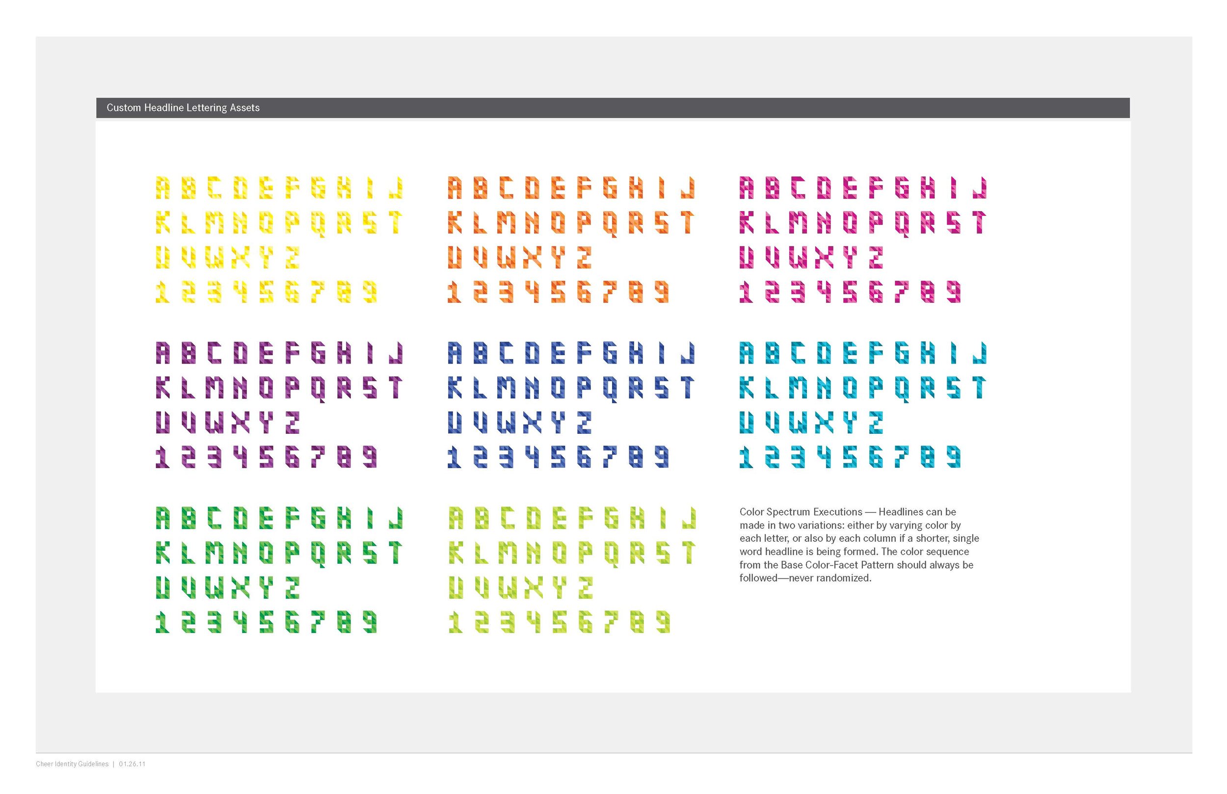
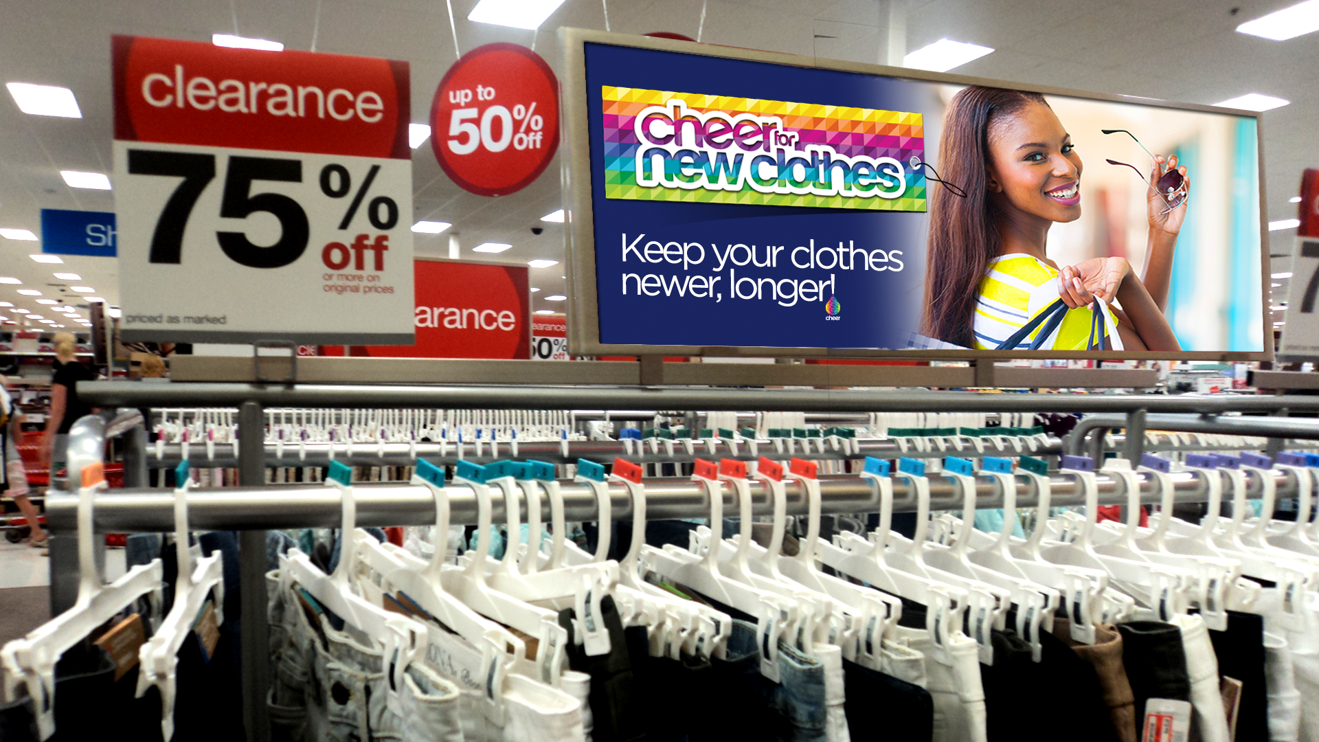
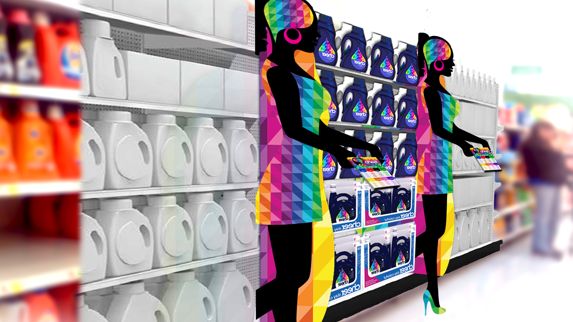
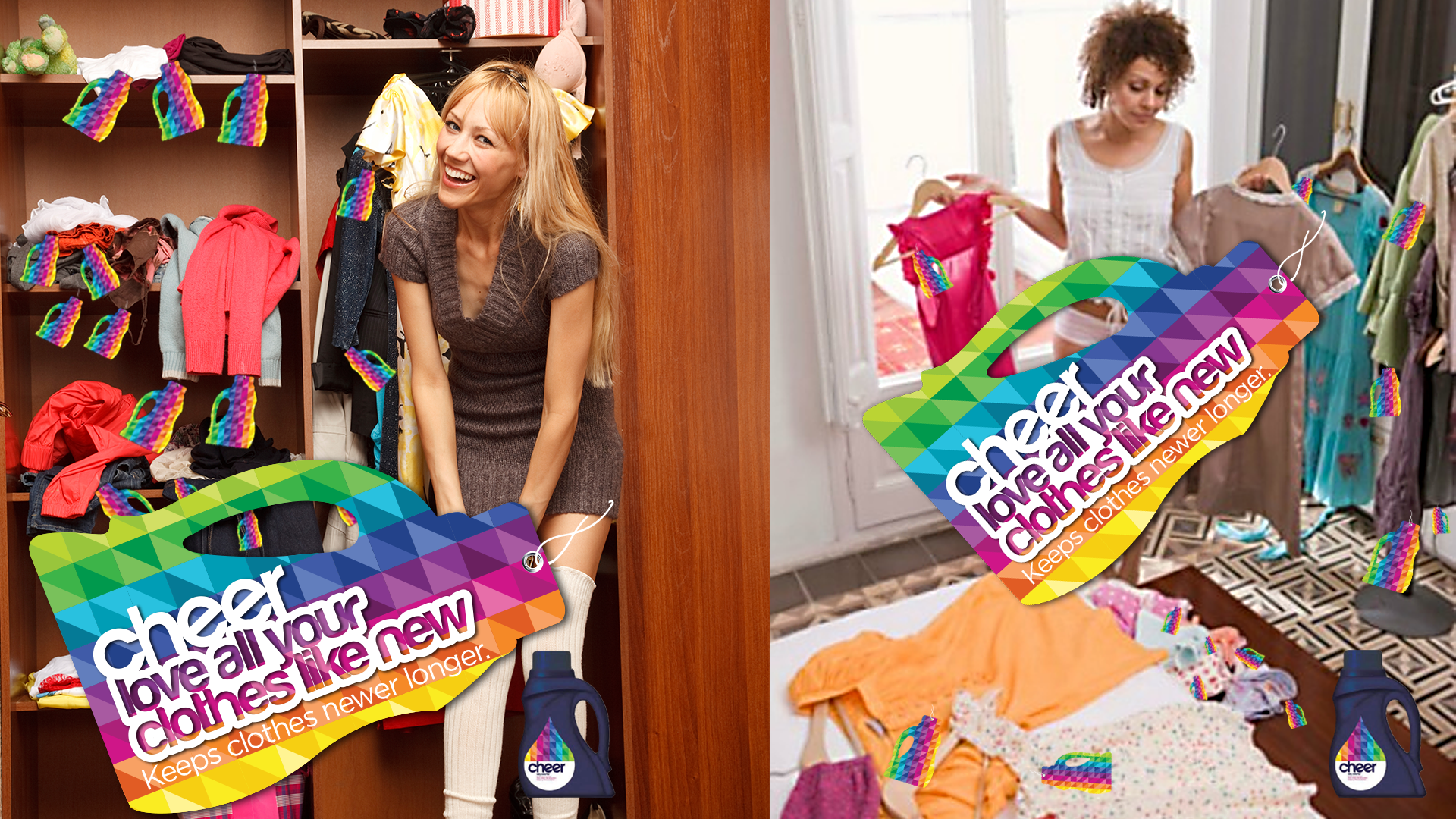
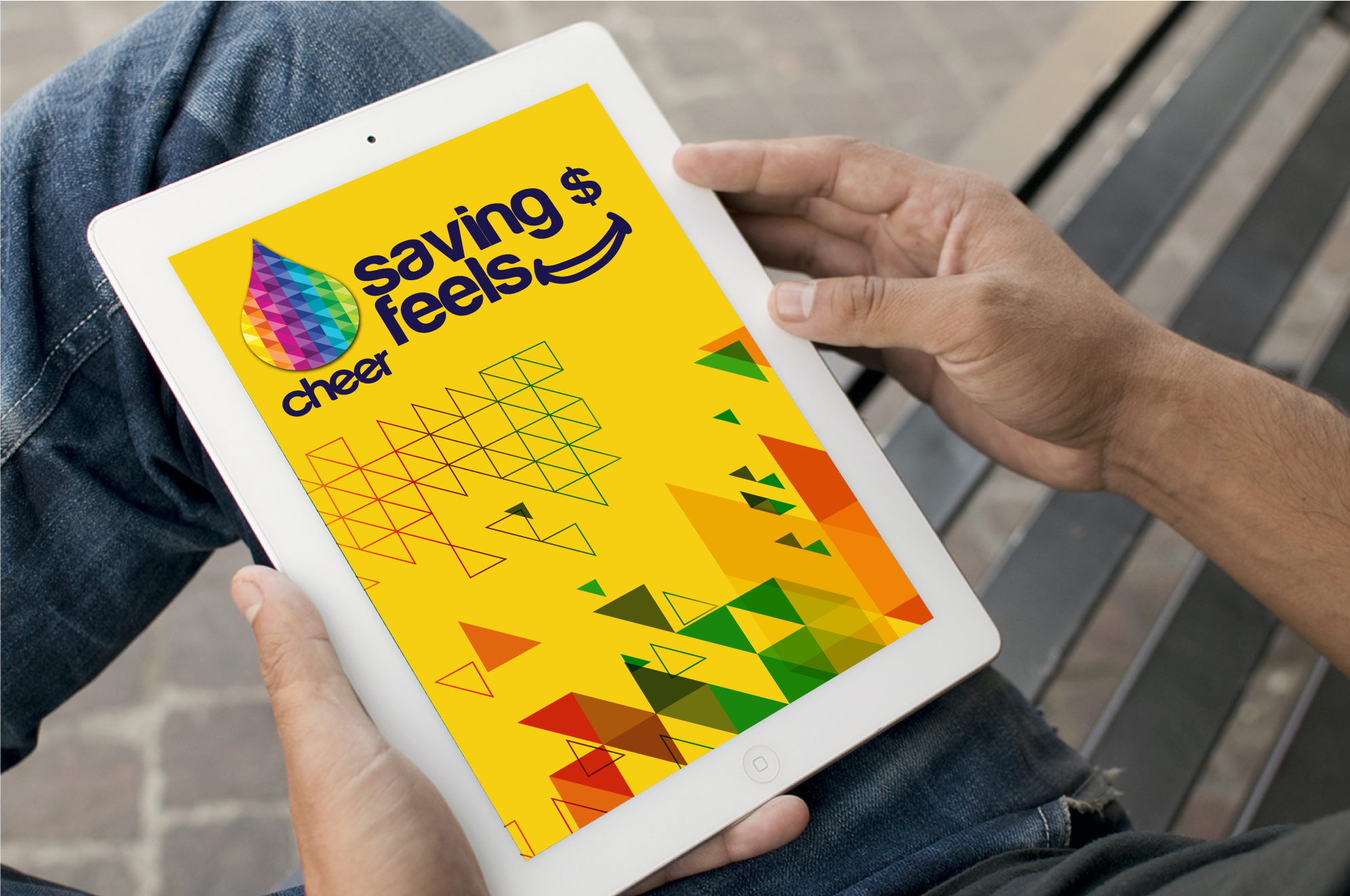
These are a few of the executions developed, everything from in-store concepts, to custom typefaces, collateral and brand experiences.
Design
This system manifests itself through an updated identity, changing patterns, and an arresting midnight blue package that practically jumps off shelf. The brand that IS colour, now is able to make a meaningful connection with the right consumer—the colourful Millennial.
