Aussie
// Haircare
Senior Creative Director
// Creative, Design, Product Marketing
Like your hair
rebrand and campaign
Aussie was looking for a multi-channel approach to relaunching their brand in order to take advantage of the social interaction they were seeing from Facebook in addition to creating a full Ad campaign and rebrand their haircare bottles. I worked on haircare bottle redesigns, the ad campaign slogan, print designs, as well as designs from the Facebook elements and print campaign.
The approach was intended for each piece of media to drive the consumer to another, so that they would share a virtuous cycle of paid, owned and earned views and engagements. Print and TV would drive to Facebook, Facebook would drive to YouTube and vice versa.
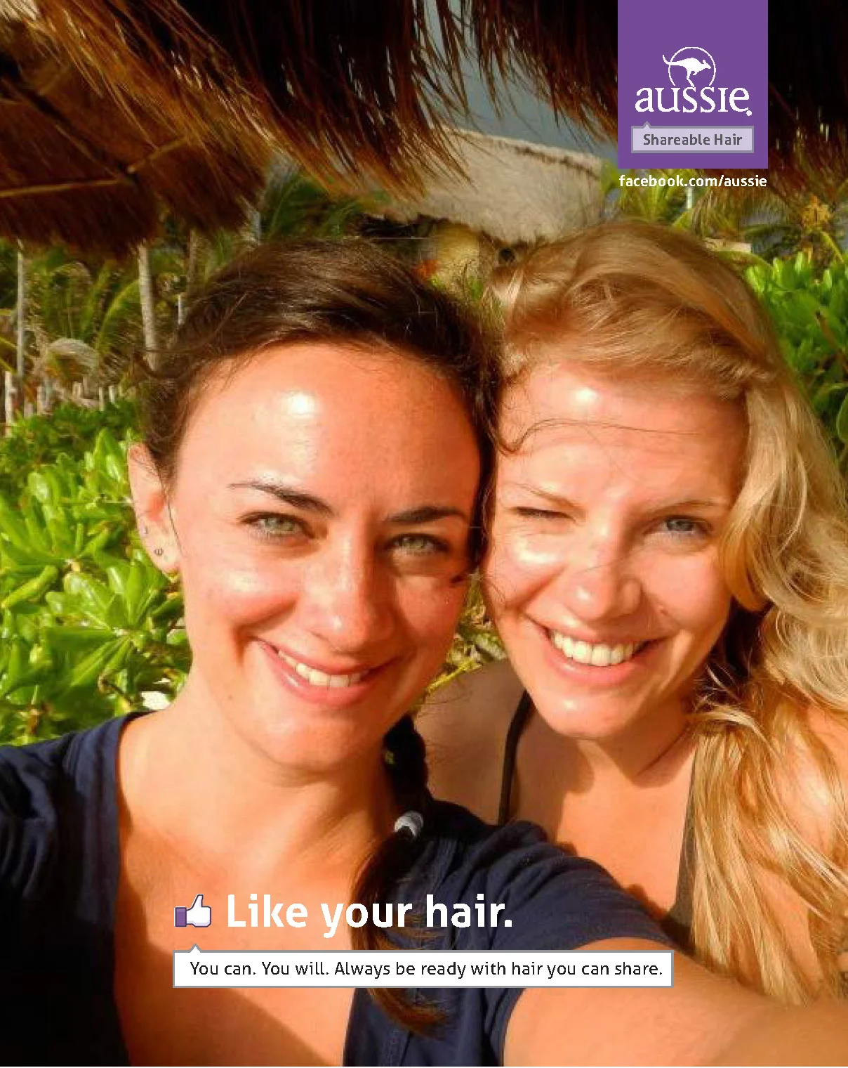
Our research had determined that many people would untag themselves from their friends photos because more often than not because they didn't like the way their hair looked in the photos. Aussie wanted to support the idea that you and your hair is always beautiful and should be embraced. We came up with "Like your hair," to work as a pun for both supporting your own self confidence as well as showing that confidence through your digital social actions.
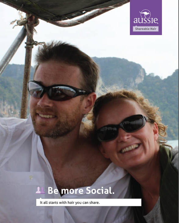
We wanted to use peoples actual Facebook photos in the campaign instead of polished photography. Using grainy, pixelated unwell lit photos added a layer of realism to the campaign.
Aussie Print Design Concepts
The comps were crafted to reflect the current state of digital activity and where most of consumer eyeballs and untagging occurred, and then drive traffic to Aussie's social platforms, primarily Facebook where they saw the most engagement.
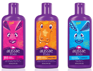
new Aussie bottle designs
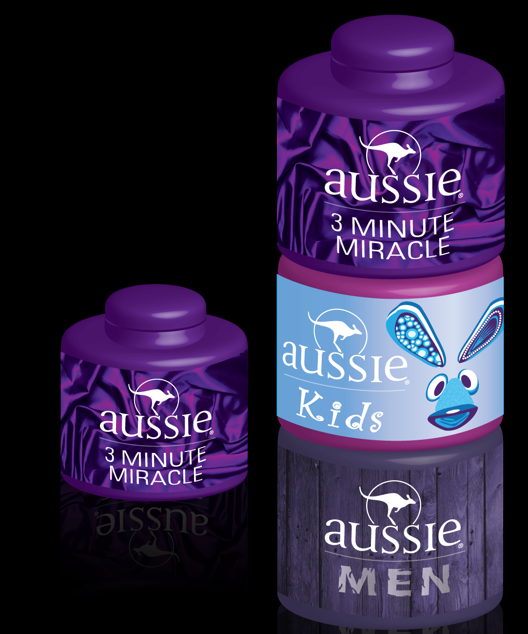
These bottles were designed to segment the primary consumers of Aussies hair care products through aesthetics while remaining close to the original visual brand language. Kids recieved fun illustrated bottle designs while women received a more classic, yet still vibrant, elegant style, and men get a more rugged design.
Aussie stackable bottles for families
In addition to the campaign I pitched a new potential bottle design that solved a pain point for many families that had to use the same shower, a stackable bottle system. The idea being that we could reduce the bottle footprint on shower shelves while allotting for the individual needs of each family member. The tops of the bottles would plug into the bottoms of the same bottle, making them uniform and refillable.
Aussie Men redesign bottles
We choose a darker color palette for the Aussie men's brand to defer to male sensibilities, but still align with Aussie brand ideology.
TV Ad Story Board
I comped together this social story board that was intended to air on TV as well as be posted on YouTube to drive traffic and consumer engagement with Aussie.
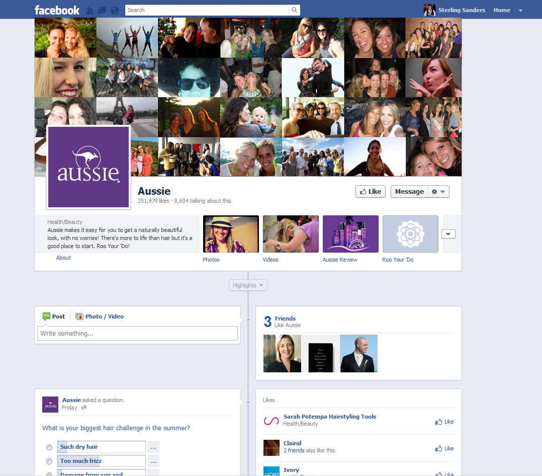
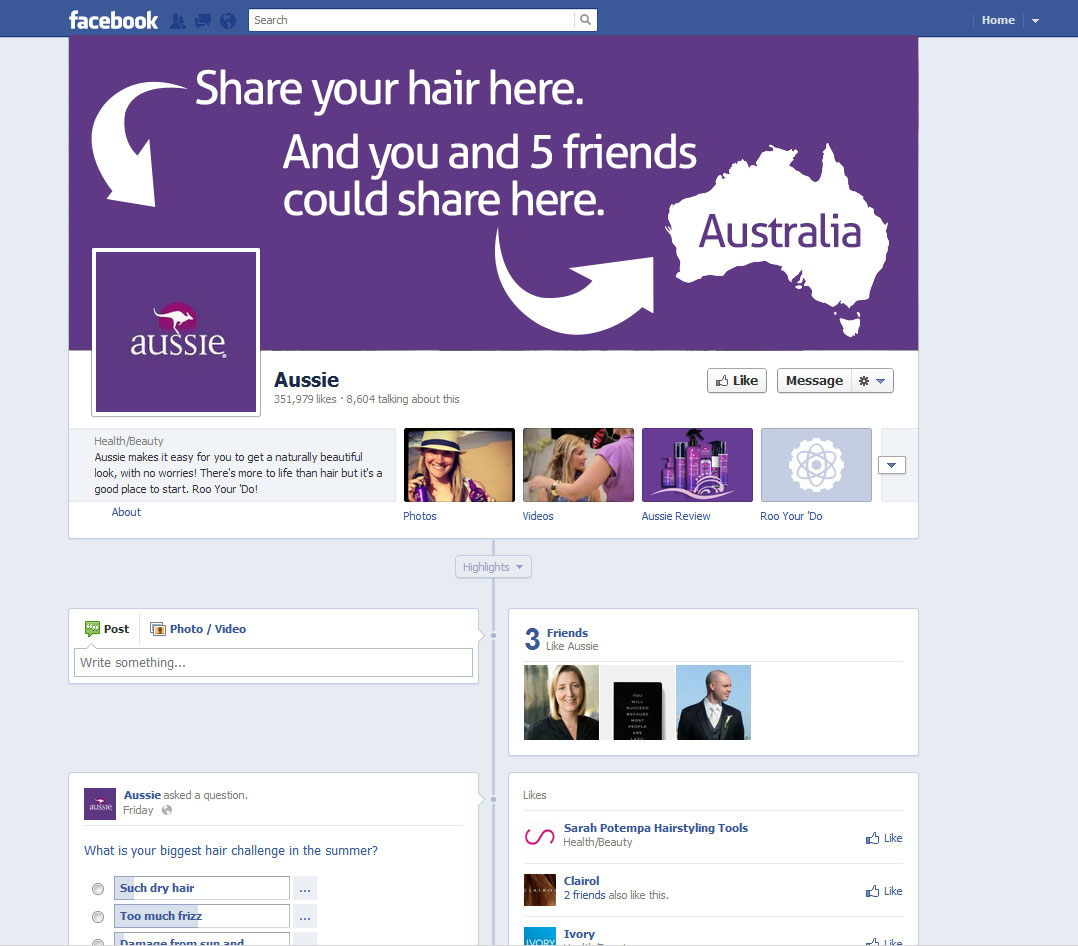
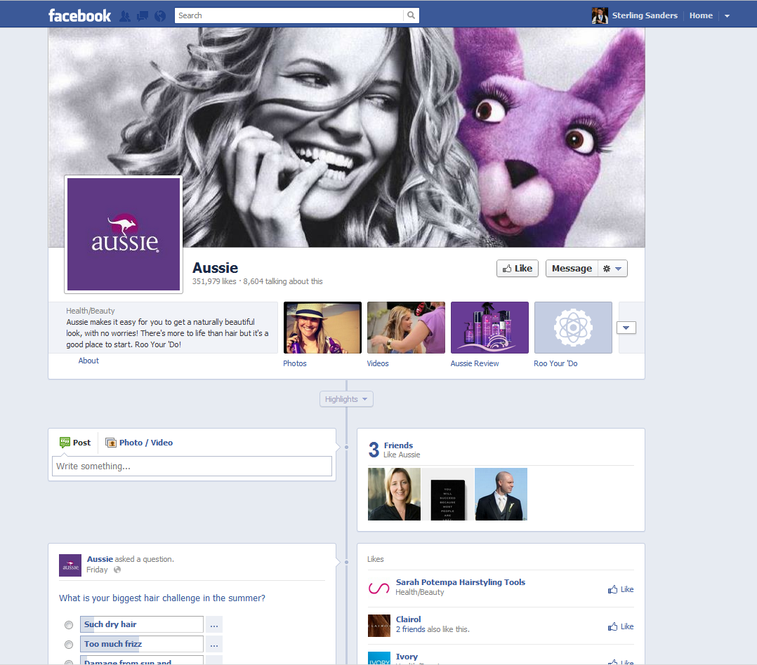
aussie facebook
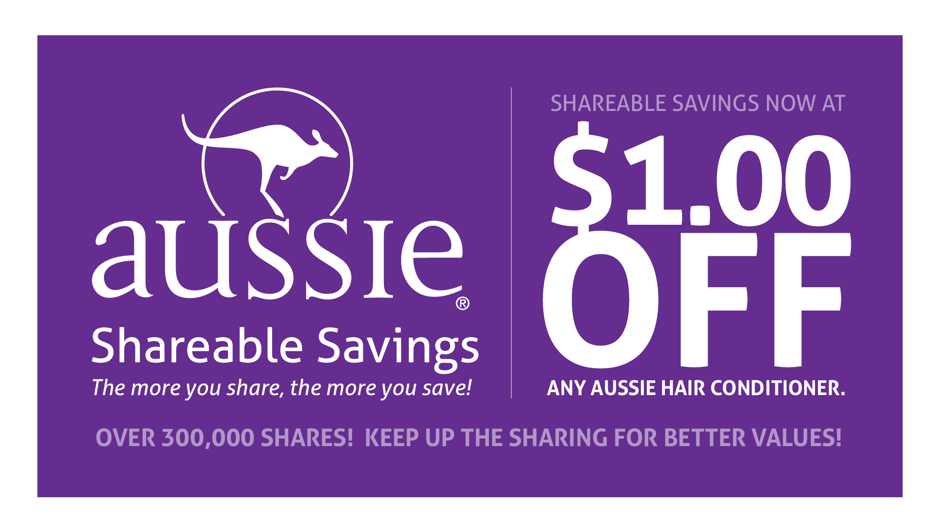
I designed many of the digital assests for the Like Your Hair campaign, from Facebook banners to ad banners, coupons, and FB ads.
